Fourteen / good design builds reputations
Renaming, rebranding and revitalising this progressive family law Chambers
CHALLENGE
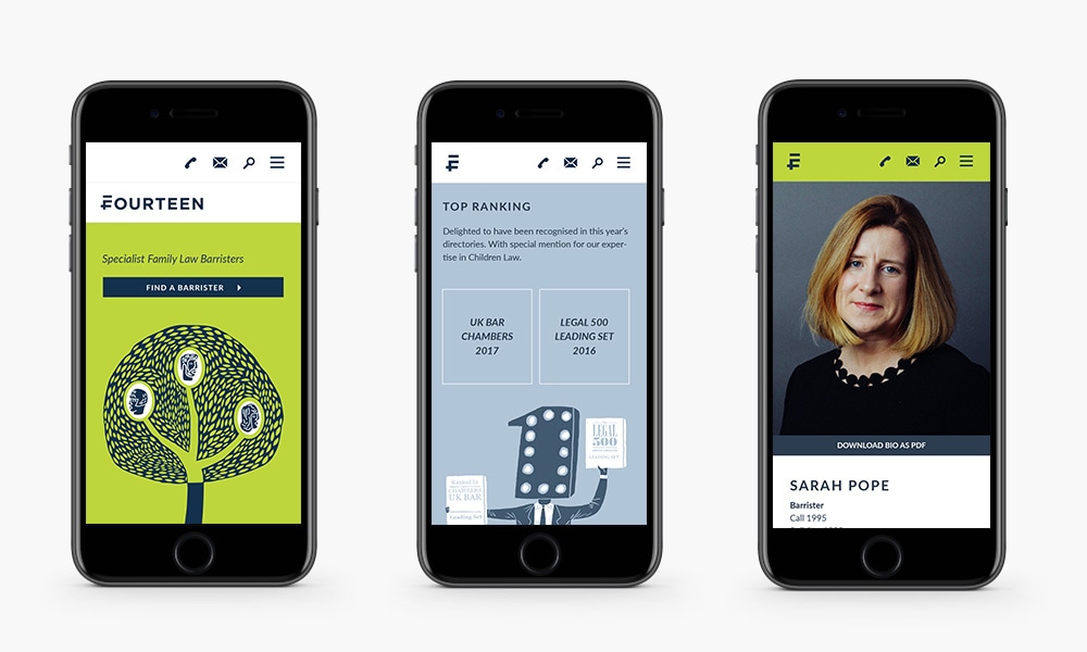
Fourteen – then named 14 Grays’ Inn Square – needed a complete brand and website overhaul. Although a chambers hugely trusted for family law, they were lost in the sea of samey competitors. To help them claim their space, we revitalised the brand from the ground up.
Strategic approach
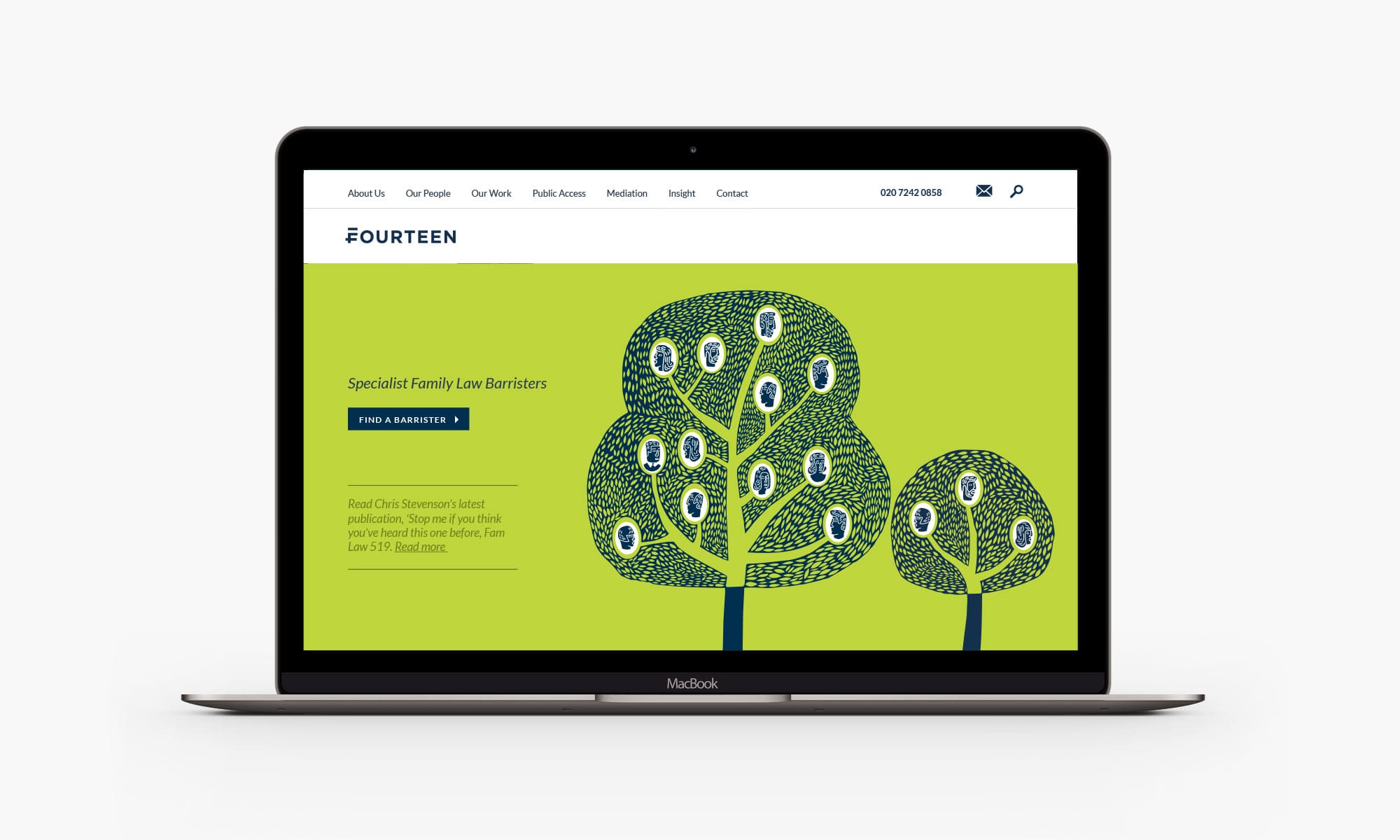
Working closely and flexibly with the chambers, we rooted our design strategy in their friendly yet progressive brand personality. Most Chambers are named after their address but in a break with tradition we rebranded them as ‘Fourteen’ to reflect their confidence and intent to modernise.
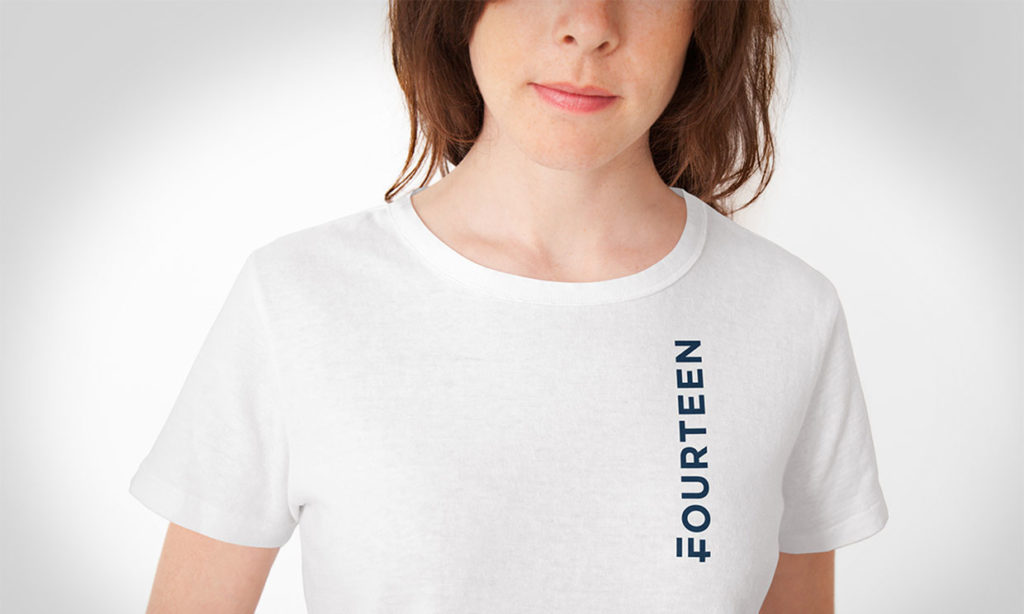
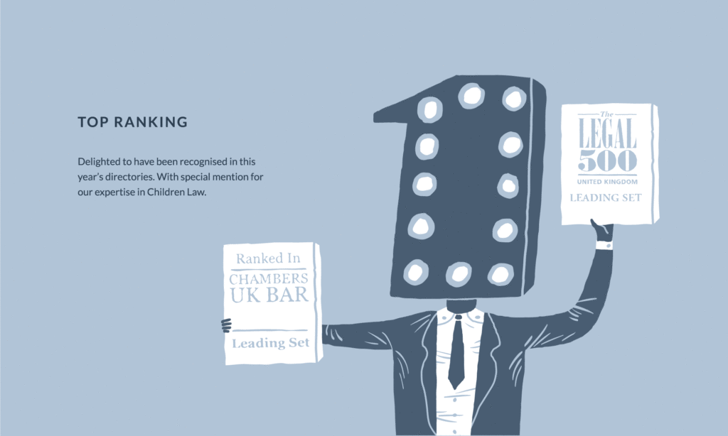
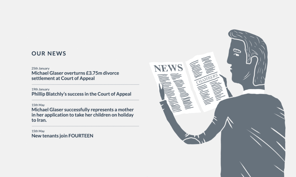
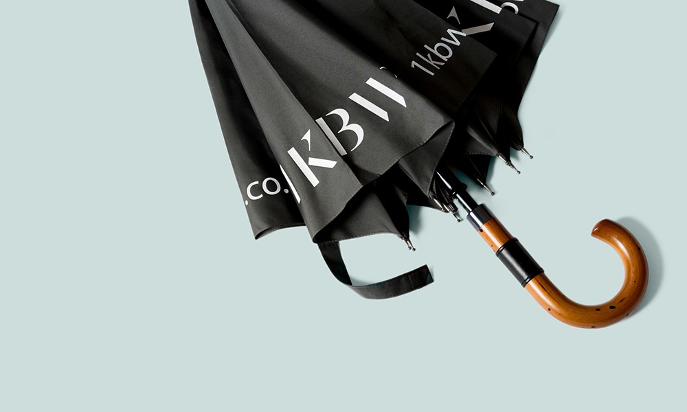
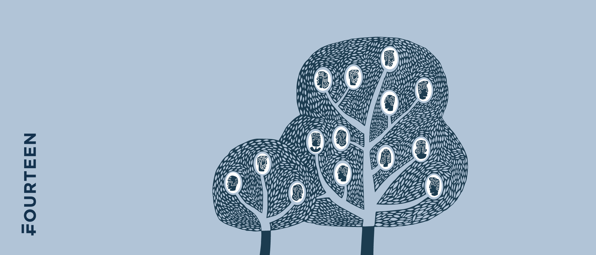
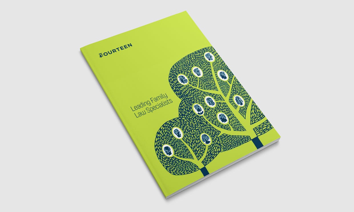
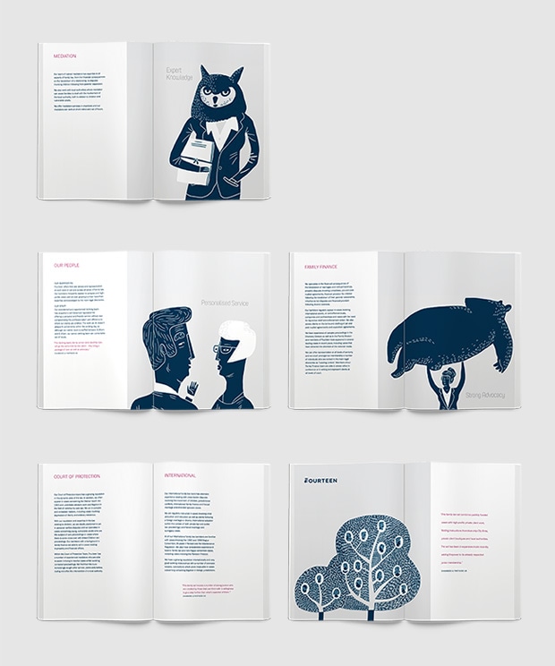
Within the logo, there is a hidden numeral 14 making up the initial ‘F’ of FOURTEEN. This unexpected twist follows throughout the brand with an idiosyncratic illustrative style and vivid colour palette. These bespoke illustrations form a resource of original imagery that can be used across exhibition graphics, digital assets and printed publications.
Results
Fourteen’s identity and website are clear, yet witty and characterful – showcasing their specialisms, expertise and practitioners while giving them an edge in their sector. In the wake of this rebrand, they received acclaim in the design and legal media, with praise such as; “A really thoughtful rebrand for London family law firm. Just goes to show, simple wins and lasts.”
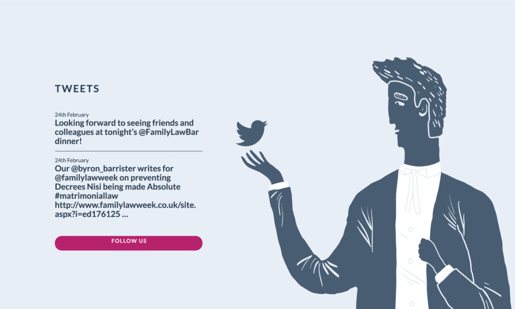
Our focus on social media across the site has also helped them rise to be the third most followed Family Law Chambers in the UK. And they don’t just stand out on social media; at industry events Fourteen feel their strong identity clearly stands them apart from their competition.
Find out more about our work for the legal sector.
Our absolute trust in Mash’s insight and creativity allowed us to spend more attention on our day jobs while they took care of our branding.”
Ella Calnan, barrister

