Views
Bespoke v. stock imagery

Stock imagery is great; cheap, quick to access and available from any number of websites. If you are looking for diagrams, photography, icons and infographics the well is deep and never runs dry. So, why do many companies and brands that use this imagery for advertising and websites struggle to stand out from the crowd?
The answer is simple — library images are generic and created to have a wide appeal. Often, this means you never find something that is exactly right for your project, but hey, it’s cheap and you don’t have the budget for anything bespoke, so it will do. But that’s the problem; it won’t do. When it comes to creating materials that make customers convert to your proposition, non-specific stock imagery just doesn’t do the business and could possibly damage the bottom line.

UX24/7
Enter Usability24/7 – a youthful London-based usability testing agency with global ambition. A key part of their marketing strategy is to share knowledge through a series of white papers. This approach demonstrates expertise, credibility and it also helps generate interest that can lead to new business opportunities and enhance the company’s growing reputation for excellence.
The problem
The white papers, although well written and packed with valuable information, looked poor, and the reason was clear — stock imagery. Huge numbers of photographs, illustrations and infographics, all in different styles and colours, contributed to choking the publication. Such heavy use of stock imagery rarely enhances the reading experience and will often act as a distraction, especially if the imagery only has a tenuous relationship to the text.
The solution
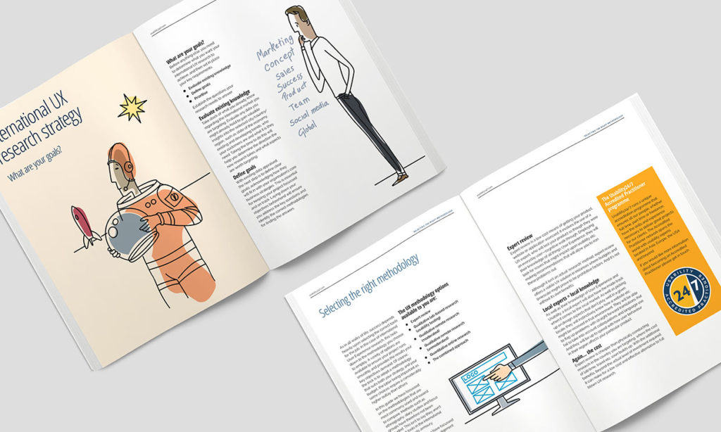
Bespoke illustration. Mash set about creating a fresh illustration style for Usability 24/7. Out went the generic imagery and in its place went illustrations of people. Usability testing is technical but ultimately it’s about peoples’ experiences of the technology. Through illustration, Mash could present those experiences allowing the reader to relate more to the service and the Usability 24/7 brand.
Result
A white paper that is leaner, less cluttered and easier to read. There are fewer illustrations, but each one serves a purpose, relating directly to the text and delightfully informing the reader along the way. With this bespoke imagery, Usability 24/7 now have full control of the design style and imagery in their publications. This material can also be deployed over multiple channels including the web and social media. Because of this illustration project the Usability 24/7 brand now stands out from the crowd. A picture is worth a thousand words but a bespoke picture worth considerably more.


The unique characters and tightening up of our brand have made a dramatic difference to how we present ourselves”
Paul Blunden – CEO, UX24/7
The client’s perspective
“We were producing good eGuides but they lacked a visual punch, largely driven by our lack of skills internally and perceived a lack of budget. Our target audience includes people in big, global companies and so it is crucial that we not only share good content but that it looks good too so the reader will engage.
Mash has provided us with a design approach, particularly to imagery that allows us to look good to any organisation, big or small. The unique characters and tightening up of our brand have made a dramatic difference to how we present ourselves. I can’t recommend Mash’s work more highly.” Paul Blunden, CEO, UX24/7
Final Thoughts
Stand out from your competitors with bespoke imagery, don’t be another zebra in the herd. In the short term, stock imagery can be a useful option, but to build a brand you need to develop a visual style that is truly yours. This may be done through illustration, photography, video, iconography or infographics that have been designed just for you. Stock is a Zebra. Bespoke is a Lion.
Quick facts: Stock vs bespoke
Stock is accessible and can be inexpensive.
Bespoke photography & illustration cost more.
Stock can look generic and like everyone else.
Bespoke is unique and promotes your brand.
Stock is licensed so anyone can use the same image.
Bespoke is your property which you own.


